Same lessons, smaller screen
The full roadmap, redesigned for thumb reach. Reading on the train or in bed feels native, not like a website squashed.
English Courses — Mobile
The same lessons, the same roadmap — on a screen designed for one hand. Download once, learn anywhere.
 Scan to open App Store
 Scan to open Google Play
Because the website is for reading and the phone is for practice — and we treat each like the medium it is.
The full roadmap, redesigned for thumb reach. Reading on the train or in bed feels native, not like a website squashed.
Read a lesson on the website, your streak ticks up. Take a quiz on the phone, the website shows the result.
A short daily session pulls in your weakest topics. The system decides what; you just open the app.
Pick the time, the app sends one quiet reminder. Skip a day, the streak holds — quality over guilt.
Native swipe gestures, haptic feedback on quiz answers, and small animations that make daily practice feel less like a textbook.
Type 'past perfect' or 'comma before but' — the lesson opens instantly. Fuzzy matching forgives typos.
Three screens you'll spend most of your time on.
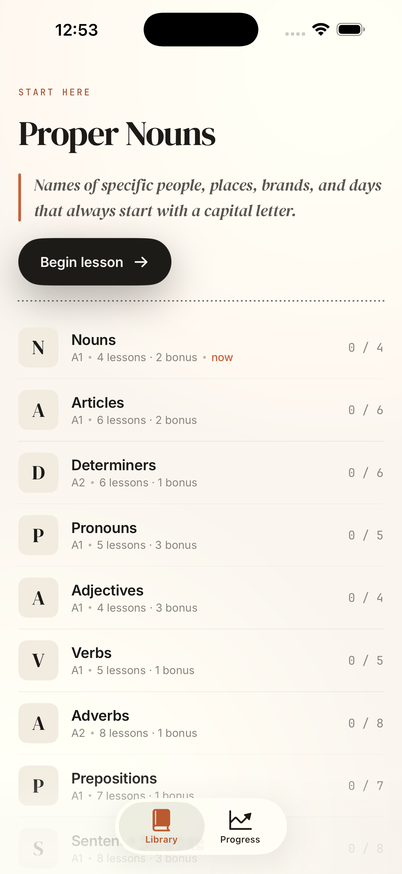
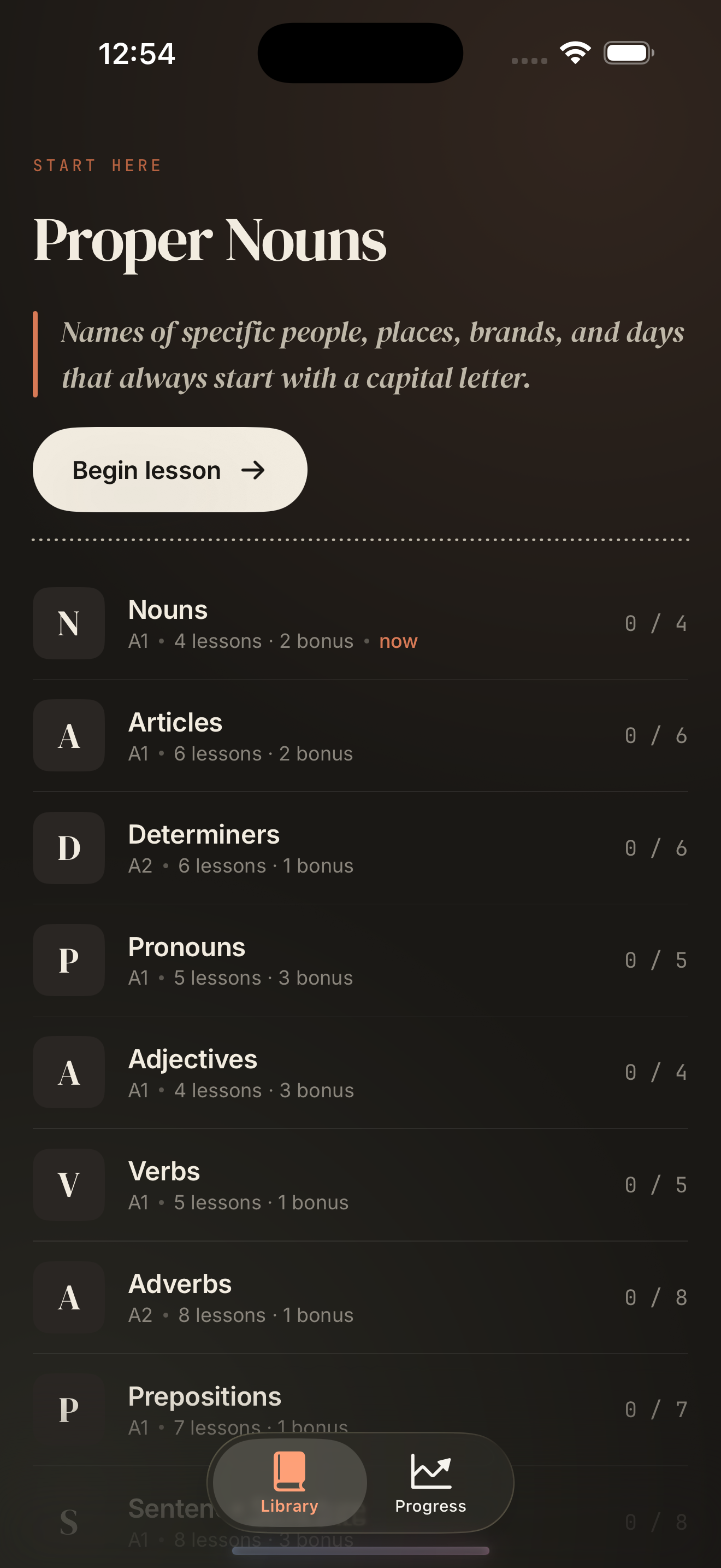
Your progress across all chapters in one editorial column. Pick up exactly where you left off.
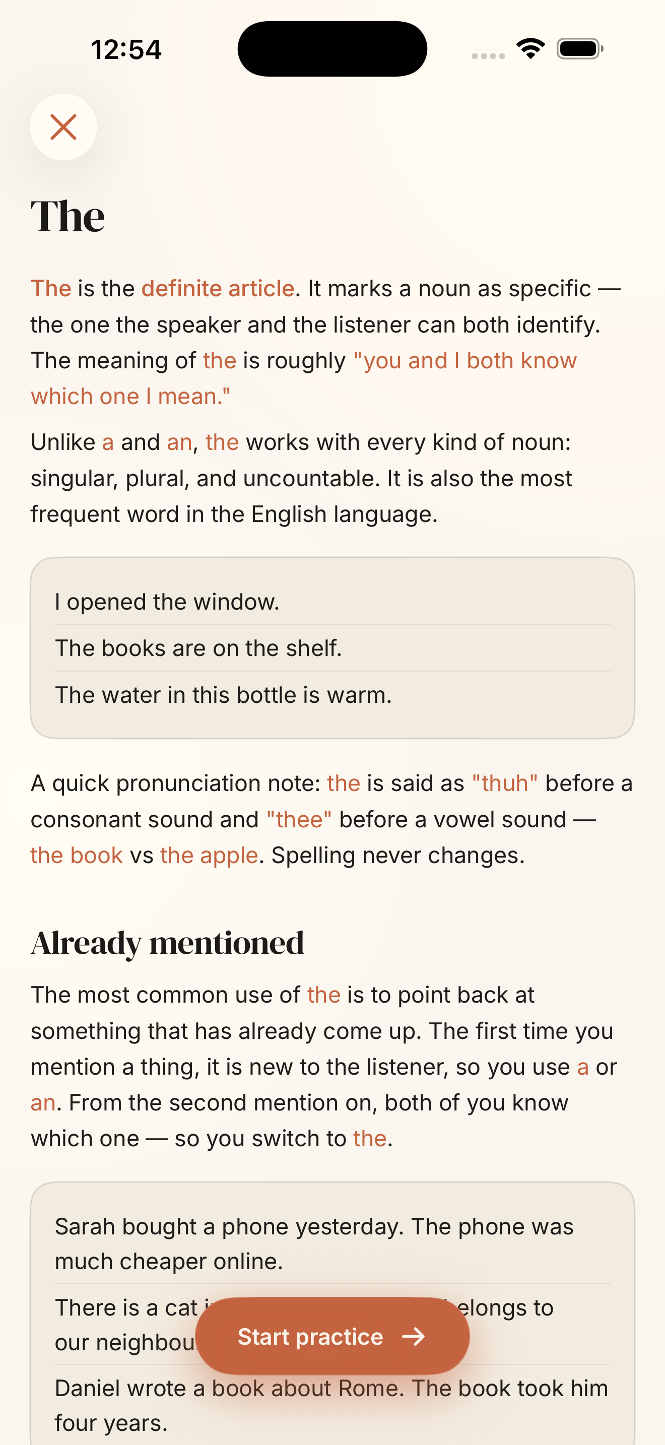
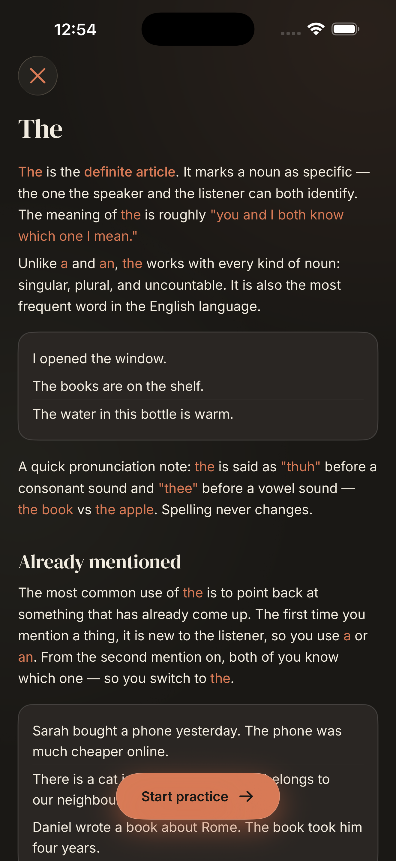
Editorial typography on a phone screen. Long-form lessons that don't feel cramped or webview-shaped.
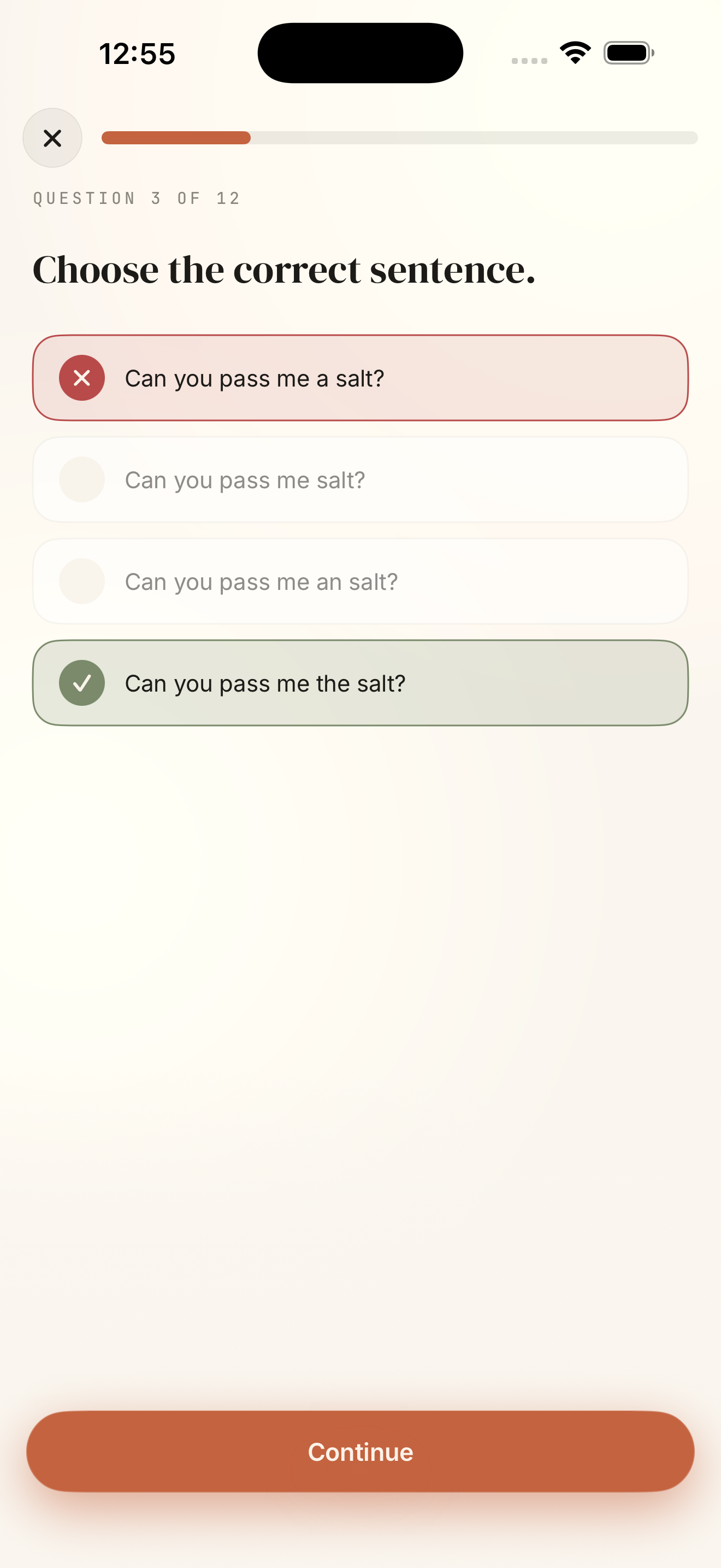
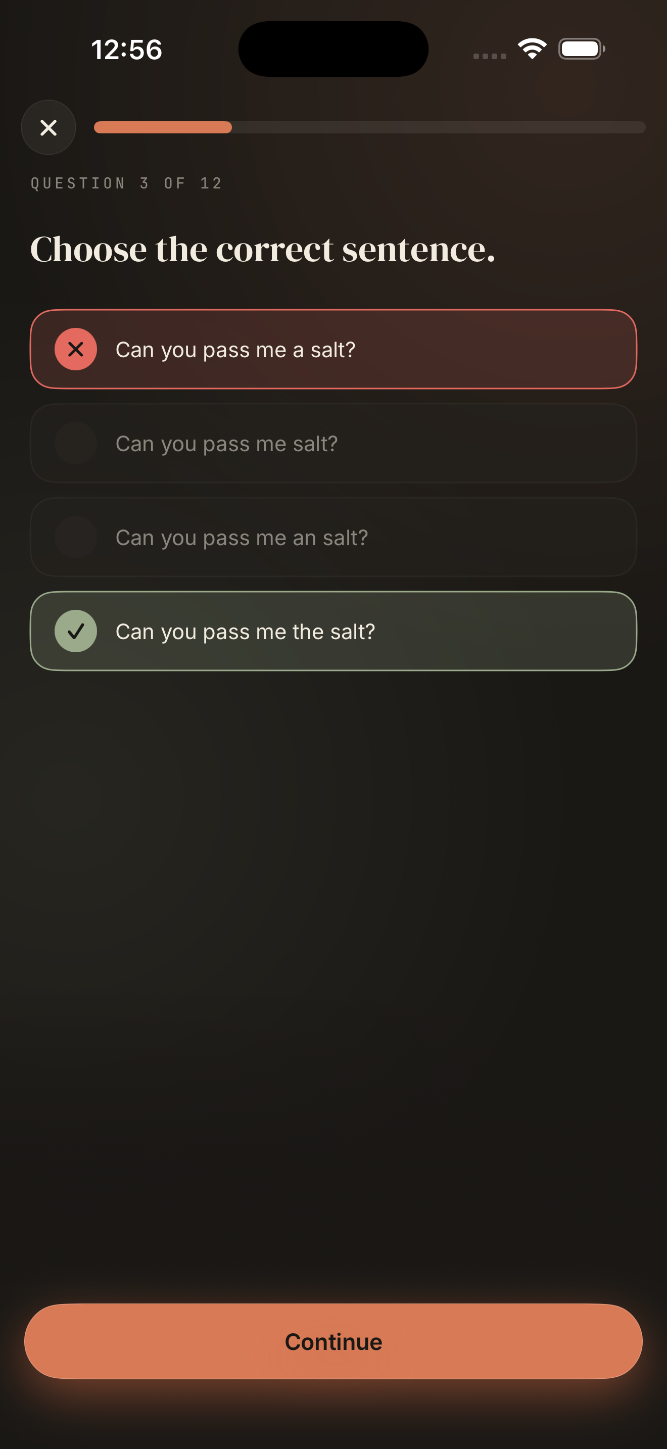
Six question types. Adaptive review pulls back what you got wrong, at the right moment.
Same Google sign-in, same progress, same lessons. Different shape.